Squarespace CSS: Create A Text Hover/Rollover Effect For Summary Wall Block [Mimics Flatiron Portfolio]
Sign up for a free Squarespace trial here! #afflink
I see a lot of people wondering how to create a hover effect that creates a text overlay with some sort of faded opaqueness when the cursor rolls over the image.
Recently, a client wanted the effect that the Flatiron template offers in their portfolio layout (but without the limitations of the rest of the template) — it’s a clean masonry wall of images (asymmetrical), text appears when you roll over each individual image, and you can click to be lead to a page that goes more in-depth. You can see an example of what I’m talking about here (just click Preview Flatiron).
It’s a really nice way of displaying a portfolio of projects.
But we were using the Pedro template (the Brine family) for it’s wonderful built-in array of styling options (especially parallax scrolling, full-bleed banners, and dynamic index pages!).
I told my client that we likely wouldn’t be able to accomplish a Flatiron style of displaying his writing projects as desired, but that I’d get creative and try to come up with something nice.
Alas - people-pleasing, perfectionistic tendencies took over and I spent several hours tinkering, piecing together random bits of code, making changes here and there, scouring Google… if you’re reading this, you know how it goes.
And I’m happy to report that I found a solution, a way of mimicking the Flatiron portfolio layout!
This may not be the cleanest CSS, so please feel free to update in the comments if you find a better way of presenting it all.
As always, you can tinker with the font and colors and other details to match the branding of the site you’re designing, but hopefully this presents a helpful solution for those of us who want to achieve text overlay hover effects in Squarespace templates where this isn’t a built-in feature.
So without further ado, here is what I did to achieve this effect!
Mimicking the Flatiron portfolio layout using Summary Wall block & CSS
Step 1: Create a “Blog” in the Not Linked section, write and publish a blog post for each portfolio item, making sure to add the thumbnail image that you want to display as the portfolio image. (This is slightly time-consuming but necessary — plus there are extra SEO benefits from presenting portfolio items as blog posts. Learn how to optimize blog posts before publishing here).
Step 2: On the page you want to showcase the portfolio wall, add a Summary Wall block.
Step 3: In the Content tab of the pop-up window, select the blog you just created with all of the posts you want to show as your portfolio wall.
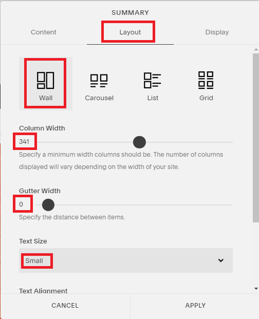
Step 4: In the Layout tab of the pop-up window, select the Wall layout, set the Column Width to 341 or whatever spacing you like, and set the Gutter Width to 0, set the Text Size to Small.
Step 5: In the Display tab of the pop-up window, set your number of items to 30, select Show Title and Show Thumbnail, DEselect Show Excerpt and Show Read More, under Primary and Secondary Metadata select None, then click Apply to save all of these changes.
Step 6: Add CSS.
In your Squarespace dashboard, go to Design > Advanced > Custom CSS, then paste the following CSS:
/*the following code mimics the portfolio flatiron template with fade in rollover text*/

/* increase image transparency on hover */
  img.summary-thumbnail-image.loaded:hover
  {
  opacity: 0.5;
  }
/* display title on hover*/ .sqs-block-summary-v2 .summary-item .summary-title a{ background-color: transparent; opacity: 0; color: #fff; position: absolute; left: 0; right: 0; top: 40%; margin-left: auto; margin-right: auto; } .sqs-block-summary-v2 .summary-item:hover .summary-title a{ background-color: transparent; opacity: 4; color: #000000; position: absolute; left: 0; right: 0; top: 40%; margin-left: auto; margin-right: auto; }/*style title font hover for summary wall block*/.sqs-block-summary-v2 {.summary-title,.summary-heading {font-family: brandon-grotesque;font-weight: 600;font-size: 33px !important;color: #33cccc;text-transform: uppercase; } }/*eliminates white space between thumbnails*/.summary-thumbnail-container,.summary-title {margin-bottom: 0 !important;}Click Save.
Voila! You should have a beautiful text hover effect now! Let me know in the comments if you have any questions or if anything didn’t work for you.
Talk to you again soon,
x
Tiffany
Welcome!
Hey there! I’m Tiffany ~ a Squarespace Web Designer & SEO Expert. I design beautiful & professional websites that rank well on Google, & I teach courses on becoming a Squarespace SEO Expert, Monetizing Squarespace, and Starting Your Own Squarespace Design Business!
Feel free to contact me at: tiffany@tiffany-davidson.com
Sign up for a free Squarespace trial here! #afflink


